


The Ultimate Watercolor Paint Set Professional Guide
You pour your time, heart, and creativity into every painting. So, you want your artwork to last, looking as vibrant in ten years as it does today. This is where the quality of your materials becomes crucial. Investing in a high-quality watercolor paint set professional artists rely on is an investment in the longevity and integrity of your work. These paints are made with archival-quality pigments that resist fading, ensuring your art stands the test of time. In this guide, we’ll explore how to choose a set that not only performs beautifully but also protects your creative legacy for years to come.
Key Takeaways
- Invest in Pigment, Not Just Paint: Professional watercolors are defined by their high concentration of pure pigment. This means you get richer, more vibrant colors and superior lightfastness, so your art looks brilliant and lasts for generations.
- Curate a Smart, Versatile Palette: Instead of buying a huge set, focus on building a smaller palette with high-quality paints. Start with essential primary colors, add versatile earth tones, and select a few unique specialty colors to define your style and ensure clean, beautiful mixes.
- Your Paint is Only as Good as Your Paper: To truly see what professional paints can do, use them with the right supporting materials. High-quality, 100% cotton paper is essential for managing water control and achieving smooth, luminous results.
What Makes a Watercolor Set "Professional"?
When you're standing in the art supply aisle, the wall of watercolor sets can feel a bit overwhelming. You’ll see boxes labeled "student" and others labeled "professional," often with a significant price difference. So, what exactly are you paying for with a professional set? It’s not just a fancy label. The difference comes down to the quality of the ingredients inside those little pans or tubes of paint, which directly impacts how they perform on paper.
Professional watercolors are made with a higher concentration of finely ground, pure pigments. This means the colors are more vibrant, intense, and consistent right out of the tube. They also have superior lightfastness, which is a technical way of saying your artwork won't fade over time. Think of it as the difference between a print that looks washed out after a year in the sun and a gallery piece that stays brilliant for generations. Beyond longevity, professional paints also tend to use single pigments for many of their colors. This is a game-changer for color mixing, allowing for cleaner, more predictable results. You get pure, luminous colors instead of muddy tones when you blend them. Upgrading to a professional set is an investment in the quality and longevity of your art, giving you the tools to create work that truly shines, much like our other curated art sets.
Pigment Quality and Concentration
The heart of any watercolor paint is its pigment, the tiny particles that give it color. Professional-grade paints use high-quality, finely milled pigments, which results in exceptionally rich and vibrant hues. They also pack a much higher concentration of this pigment compared to student-grade paints, which often contain more fillers and binders. This high pigment load means a little paint goes a long way. You can achieve deep, brilliant colors with just a touch of paint, and they dilute beautifully with water to create transparent washes without losing their intensity. It’s this quality that gives professional artwork its signature luminosity and depth.
Lightfastness: Will Your Colors Last?
Have you ever seen an old painting where the colors still look as fresh as the day they were painted? That’s the magic of lightfastness. This term refers to a pigment's ability to resist fading when exposed to light over time. Professional watercolor brands test their paints rigorously and provide a lightfastness rating on their packaging. For an artist, this is a huge deal. It means you can confidently sell or display your work knowing the colors will remain true and vibrant for decades, or even generations. Student-grade paints often have lower lightfastness ratings, making them great for practice but less ideal for pieces you want to preserve.
Single-Pigment vs. Multi-Pigment Colors
When you look at a tube of professional paint, you’ll often see a code indicating which pigment was used. Many professional colors are made from a single, pure pigment. This is a key advantage because it gives you incredible control over your color mixing. When you mix two single-pigment colors, the result is clean, bright, and predictable. In contrast, many student-grade paints are made from a mix of several different pigments to approximate a certain hue. When you try to mix these multi-pigment colors together, you’re essentially mixing a whole bunch of different pigments, which can easily result in dull or muddy shades.
Professional vs. Student Grade: What's the Real Difference?
Walking down the art supply aisle, you’ve probably noticed the price gap between student and professional watercolors. Is it just marketing, or is there a real reason for the difference? The short answer: it’s a night-and-day difference. Upgrading to a professional set can completely change your painting experience, from the vibrancy of your colors to the longevity of your finished piece. Let's break down exactly what you're paying for.
Color Intensity and Vibrancy
The biggest difference you’ll notice right away is the color payoff. Professional watercolors are packed with a much higher concentration of finely ground pigment and less binder. This means your colors will be incredibly rich, bright, and vibrant straight from the tube or pan. A tiny dab of professional paint goes a much longer way than its student-grade counterpart, allowing you to create bold, luminous washes that won't look chalky or dull when they dry. It’s the secret to making your artwork truly pop.
Mixing and Transparency
Ever mix what you thought would be a lovely purple and end up with a muddy brown? Professional paints can help you avoid that. Many professional colors are formulated with a single pigment, which results in cleaner, more predictable mixes. When you combine two single-pigment colors, you get a pure, brilliant secondary color. Student-grade paints often use multiple pigments and fillers to create a hue, which can lead to murky results when mixed. This purity gives you greater control and a much wider, more beautiful range of colors to work with.
Longevity and Archival Quality
You pour your heart into a painting, so you want it to last. This is where archival quality comes in. Professional watercolors are rated for lightfastness, which is a measure of how resistant the pigment is to fading when exposed to light. These paints are designed to stand the test of time, ensuring your artwork remains as vibrant as the day you painted it for decades to come. Student-grade paints often use pigments that can fade significantly over time, so investing in lightfast colors is essential for any artist who wants to sell their work or create lasting pieces.
Price vs. Value
There’s no denying that professional watercolors are a bigger investment. But it’s important to think in terms of value, not just price. Because they are so pigment-rich, a little goes a long way, and your pans or tubes will last much longer. You're paying for higher-quality ingredients, lightfastness, and superior performance that will save you frustration and help you grow as an artist. Investing in good paints is like investing in good tools for any craft. It makes the process more enjoyable and the results far more rewarding. A great set of paints deserves a great workspace, so consider setting up some functional storage and organization to keep your supplies in top shape.
Top Professional Watercolor Brands to Know
When you're ready to invest in professional paints, you'll find a lot of incredible options out there. It can feel a little overwhelming, but a few brands consistently rise to the top for their quality, performance, and reliability. These are the names you'll hear artists recommend time and again. Getting to know what makes each one special will help you find the perfect set to match your artistic style. From historic European makers to innovative American companies, each brand offers something unique for your creative practice. Let's look at some of the most respected names in the watercolor world so you can choose your next palette with confidence.
Winsor & Newton Professional
A true classic in the art world, Winsor & Newton has been a trusted name for centuries. Their Professional Watercolour line is known for its exceptional quality and performance. The colors are incredibly vibrant and made with pure pigments, which means they mix cleanly without getting muddy. One of their biggest strengths is lightfastness, a term for how resistant the color is to fading when exposed to light. With these paints, you can be confident that your artwork will stay bright and true for years to come. They offer a huge range of colors, making it easy to build a palette that’s perfectly suited to your work.
Daniel Smith
If you love exploring unique and dynamic colors, Daniel Smith is a brand you need to know. While they offer a fantastic range of traditional colors, they are famous for their innovative pigments. Many of their paints are made from authentic minerals and semi-precious stones, creating one-of-a-kind textures and granulating effects that can add incredible depth to your work. Their professional series paints are packed with high-quality pigment, resulting in rich, intense colors that go a long way. Artists love them for their vibrancy and the sheer excitement of discovering new, expressive hues you just can't find anywhere else.
Schmincke Horadam Aquarell
Hailing from Germany, Schmincke is a premium brand that represents the best in quality and craftsmanship. Their Horadam Aquarell line is a favorite among serious artists for its buttery consistency and incredible re-wettability. This means that even after the paints have dried on your palette, they are easy to reactivate with a wet brush, returning to their original creamy texture. This feature is perfect for artists who work both in the studio and on the go. The colors are brilliant and highly concentrated, and the brand adheres to strict quality control, ensuring every tube or pan you buy performs beautifully and consistently.
Sennelier L'Aquarelle
Sennelier brings a touch of French elegance to the watercolor world. This historic brand, once a supplier to artists like Cézanne and Picasso, has a unique recipe for its paints. Sennelier's L'Aquarelle watercolors are made with a honey-based binder. This special ingredient not only acts as a preservative but also gives the paints a luminous, brilliant quality and an exceptionally smooth flow. The honey helps the colors glide across the paper and enhances their vibrancy. If you're looking for paints that feel luxurious to work with and produce bright, radiant results, Sennelier is an absolutely beautiful choice.
MaimeriBlu
Made in Italy, MaimeriBlu watercolors are crafted with a simple philosophy: to create the purest colors possible. They are known for their incredibly high pigment concentration and a commitment to using single-pigment colors whenever they can. This is a huge advantage for artists who love to mix their own shades. Because you're starting with a pure color, your mixes will be cleaner, brighter, and more predictable, without any risk of turning dull or muddy. Their entire line is exceptionally lightfast, ensuring your work is archival. For painters who prioritize color purity and brilliant, clean mixes, MaimeriBlu paints are an outstanding choice.
How to Choose Your Professional Watercolor Set
Ready to find the perfect professional watercolor set? It’s about more than just picking your favorite colors. The real magic of professional paints lies in their specific properties and how they behave on paper. Understanding a few key characteristics will help you select a set that truly matches your artistic style. When you're comparing options, pay close attention to four main things: the transparency of the paints, whether they have a granulating texture, how well they re-wet and flow, and their potential for color mixing. These qualities are what separate good paints from great ones and will give you much more control and vibrancy in your work. Let's look at what each of these terms actually means for your art.
Transparency and Opacity
One of the most beloved qualities of watercolor is its luminosity, and that comes from transparency. High-quality professional watercolor paints are typically transparent, which means they allow light to pass through the paint and reflect off the white of the paper underneath. This is what gives watercolor paintings their signature bright, glowing look. When you layer transparent colors, you can create beautiful, clean mixes directly on the page. While most watercolors are transparent, some are semi-opaque or opaque. Opaque colors have more covering power and are great for adding final details or highlights over darker layers, but a good starter set will focus on transparent pigments.
Granulation and Texture
Have you ever seen a watercolor painting with a beautiful, subtle texture in the washes? That’s called granulation. This happens when heavier pigment particles settle into the textured surface of the watercolor paper, creating a slightly grainy or mottled effect. It’s a desirable characteristic that can add depth and interest to your work, especially in landscapes or abstract pieces. Professional series watercolors often have a higher pigment concentration, which not only results in more vibrant colors but also enhances effects like granulation. This high pigment load also contributes to their lightfastness, ensuring your artwork won't fade over time.
Re-wettability and Flow
Professional watercolors are a joy to work with, and a big part of that is their re-wettability and flow. Re-wettability is just a simple way of saying how easily the dried paint in your pan comes back to life with a wet brush. Pro-grade paints activate instantly, giving you rich color without having to scrub your brush into the pan. Flow refers to how the paint moves with water across your paper, allowing for smooth washes and delicate blends. Many lightfast pigments in these sets are made from a single source, which helps you create pure, clean color mixes instead of muddy shades.
Color Range and Mixing Potential
It can be tempting to buy a set with dozens of colors, but a wider range doesn't always mean better quality. What’s more important is the mixing potential of the colors you have. Because high-quality paints use superior, finely ground pigments, their colors are stronger and mix together cleanly without becoming dull or muddy. A well-curated set of 12 to 14 essential colors can create a virtually limitless palette. When choosing a set, look for one with strong, clear primary colors (a red, a yellow, and a blue), as these will be the foundation for everything else you mix. This approach gives you more creative freedom than a giant set of pre-mixed convenience colors.
Finding the Right Set for Your Skill Level
Choosing a professional watercolor set is less about strict rules and more about finding the right fit for where you are in your artistic journey. Whether you're just moving beyond the basics or you're a seasoned painter looking to refine your palette, there’s a perfect set waiting for you. The key is to match the paint's qualities with your current needs and future goals. Let's look at what to consider at each stage.
For Beginners Ready to Upgrade
If you've been painting for a little while with student-grade sets, you might be wondering if upgrading is worth it. When it comes to watercolor, the answer is a resounding yes. Unlike other paints where you can get by with cheaper options, the quality of your watercolor paint makes a huge difference in your results. Professional paints have a higher pigment load, which means richer colors and a smoother application. Instead of buying a huge set of mediocre colors, focus on a smaller, curated set of high-quality professional watercolors. This selective approach will help you learn color mixing properly and prevent the frustration that often comes with chalky, weak student paints.
For the Intermediate Artist
You’ve got the fundamentals down and you’re starting to develop your own style. Now is the time to get more intentional with your palette. As an intermediate artist, you can focus less on the number of colors in a set and more on their specific qualities. This is a great time to explore professional or artist-grade lines from brands like Winsor & Newton, Daniel Smith, or Schmincke. You’ll notice a major improvement in how the colors mix and layer. Start by identifying the colors you use most and invest in high-quality tubes or pans of those specific shades. This allows you to build a custom palette that truly reflects your artistic voice.
For the Advanced Painter
As an experienced painter, you demand the most from your materials. You’re likely working on complex pieces that require precise control over transparency, granulation, and layering. Top-tier professional watercolors are designed for this level of artistry. Brands like Winsor & Newton prioritize pigment purity and lightfastness, ensuring your work has incredible depth and will last for generations. These paints mix cleanly, allowing you to create nuanced shades and beautiful, transparent washes that let the light of the paper shine through. At this stage, you’re not just buying paint; you’re investing in tools that can fully execute your creative vision without compromise.
Building Your Essential Pro Palette
Creating your own professional watercolor palette is one of the most personal and rewarding parts of painting. It’s like building a toolkit that’s perfectly suited to your style and subjects. While the final selection will be uniquely yours, every great palette starts with a solid foundation. Think of it in three layers: the essential primaries that will form the basis of every color you mix, the earth tones that will ground your work in reality, and the special accent colors that will make your art truly sing. Let's walk through how to choose the best colors for each category, so you can build a palette that feels both versatile and inspiring.
The Must-Have Primary Colors
Your primary colors (a red, a yellow, and a blue) are the absolute workhorses of your palette. With just these three, you can mix an entire rainbow. But choosing the right ones can feel overwhelming. The key is to select high-quality, single-pigment paints that mix cleanly. Look for a warm and a cool version of each primary if you can, for example, a cool, lemony yellow and a warm, golden yellow. This "split primary" system gives you the widest possible mixing range. A good guide to watercolor paints can help you understand the properties of different pigments, like their temperature and transparency, so you can build a powerful mixing foundation from the start.
Essential Earth Tones and Neutrals
While vibrant primaries are exciting, earth tones and neutrals are what give your paintings depth, shadow, and a sense of realism. Colors like Burnt Sienna, Raw Umber, and Payne’s Gray are non-negotiable for most artists. They are perfect for creating natural landscapes, realistic skin tones, and moody shadows. This is an area where quality really shows. Professional paints use better materials, which results in richer, more complex earth tones that don't look flat or muddy when mixed. Investing in a few high-quality neutral tubes will make a noticeable difference in the sophistication and dimension of your work.
Specialty Colors Worth the Investment
Once you have your primaries and neutrals, it's time for the fun part: specialty colors! These are the unique, vibrant hues that catch your eye and reflect your personal style. It could be a brilliant Quinacridone Magenta, a granulating Cobalt Teal, or a deep Perylene Green. These colors can save you mixing time and add effects you can't get otherwise. When choosing them, look for paints made from a single pigment. These offer the purest color and mix beautifully without creating dull, muddy shades. Don't feel like you need dozens; just two or three carefully chosen specialty colors can completely define your artistic voice and make your paintings stand out.
How to Get the Best Results From Your Pro Paints
Okay, you’ve invested in a beautiful set of professional watercolors. Now what? Getting the most out of these high-quality paints involves more than just dipping a brush in color. Professional paints behave differently than student-grade ones, thanks to their high pigment concentration and quality binders. They offer incredible vibrancy and control, but you need to adjust your technique to really make them sing. By focusing on a few key areas, you can transform your painting practice and create the stunning, light-filled art you've been dreaming of. Let's get into the practical steps that will make a real difference.
Mastering Water Control
This is the big one. With professional watercolors, water is your best friend and your biggest challenge. Because these paints are so packed with pigment, a tiny bit goes a long way, and how you use water will determine everything from transparency to blending. Without good water control, you'll have a tough time blending smoothly. A great habit to build is using two jars of water: one for rinsing brushes and another for clean water to mix with your paints. Practice basic watercolor techniques like wet-on-wet (painting on wet paper) for soft, diffused effects and wet-on-dry (painting on dry paper) for crisp, defined edges.
Choosing and Caring for Your Brushes
The right tools make all the difference, and your brushes are just as important as your paint. While some professional sets include quality brushes, it’s wise to invest in a few core brushes that feel good in your hand. You don’t need a huge collection to start. A medium round brush, a flat brush for washes, and a small detail brush will cover most of your needs. When you're ready to expand, you can explore different types of watercolor brushes to find what works for your style. To make them last, always rinse your brushes thoroughly after painting, gently reshape the bristles with your fingers, and let them dry horizontally or hanging upside down.
Color Mixing Fundamentals
One of the joys of professional paints is their ability to create clean, vibrant mixes. This is often because many colors in a pro set are made from a single pigment. Single-pigment paints mix more cleanly and are less likely to create dull, muddy shades. To get to know your new palette, the first thing you should do is create a mixing chart. This simple exercise helps you see how each color interacts with the others and is an invaluable reference. Understanding some basic color theory will also help you mix with intention, so you can create harmonious and dynamic color combinations in your work instead of just hoping for the best.
Common Mistakes to Avoid
When you switch to professional paints, it’s easy to fall into a few common traps. First, don't be afraid to use your paint! Pro paints are so vibrant that you might be tempted to use too much water and not enough pigment, resulting in washed-out colors. Load your brush with rich color. Another key is to use the right paper. Professional paints perform best on high-quality, 100% cotton watercolor paper (140 lb. or heavier). This type of watercolor paper can handle multiple layers and lots of water without buckling or falling apart. Finally, try not to overwork an area. Let layers dry completely before adding more to keep your colors fresh and transparent.
How Much Do Professional Watercolor Sets Cost?
Figuring out the cost of professional watercolor sets can feel a bit like navigating a new city. Prices can range from surprisingly affordable to a serious investment, depending on the brand, the number of colors, and whether you choose pans or tubes. The good news is there’s a high-quality option for almost every budget. Unlike student-grade paints, professional watercolors are packed with finely ground, lightfast pigments, which means your colors will be more vibrant and won't fade over time.
Think of it as an investment in your art. While the initial cost might be higher, professional paints go a long way. Their high pigment concentration means a little dab of color can be stretched much further than a student-grade equivalent. Whether you're just upgrading from your first set or you're a seasoned artist looking to try a new brand, let's break down what you can expect to spend.
Budget-Friendly Pro Options
You don’t have to spend a fortune to get your hands on artist-grade paints. The key is to shop smart. Many top-tier brands offer smaller, curated sets that provide professional quality at a more accessible price point. When you're searching, one artist on Reddit advises to "[l]ook for a good sale on Windsor Newton, Sennelier, Schmincke, Daniel Smith but be sure it is the professional or artist line, not students or." This is a crucial tip. A brand’s professional line will always outperform its student line, so double-check the label. Starting with a limited palette of 12 high-quality colors is often a better move than buying a huge set of lower-quality paints.
Mid-Range Sets for Serious Artists
If you've been painting for a while and feel committed to your craft, a mid-range set is a fantastic next step. These sets offer an excellent balance of quality and cost, providing a wider range of colors and consistently brilliant results. You’ll find that these paints mix cleanly and allow for beautiful, transparent layers. As Urban Sketching World notes, "[i]f you are a watercolour artist, painting in a studio, then the consideration of how many colours or the size of your set is not so important," because you can build your collection over time. A solid mid-range set gives you a strong foundation to do just that, with reliable core colors and a few unique pigments to play with.
Premium and Specialty Collections
For the artist with fewer budget constraints, the world of premium watercolors is a joy to explore. These sets are the best of the best, featuring exceptionally high pigment loads, rare and unique colors, and impeccable lightfastness. A fellow artist on Facebook shared some top recommendations, saying, "[g]reat prof brands if no budget restrictions: Schmincke, Windsor Newton, Daniel Smith, Holbein etc." These brands are renowned for their quality and are a favorite among professional artists who sell their work. Investing in a premium set means you're getting paints that perform beautifully and will ensure your artwork lasts for generations.
Where to Find the Best Deals
Knowing where to shop can save you a lot of money. Large art supply retailers are often a great place to start. For instance, you can shop watercolor paint sets at Blick, where they offer a huge selection of "watercolor pans and tube sets... [p]erfect for beginners and professionals." Don't forget to check out your local art supply store, as they often have knowledgeable staff and member discounts. It’s also wise to keep an eye out for seasonal sales, especially around the holidays or back-to-school season, as many retailers offer significant markdowns on professional art supplies. Signing up for newsletters from your favorite brands or stores will also keep you in the loop on special promotions.
How to Care for Your Professional Watercolors
Storing Your Paints Correctly
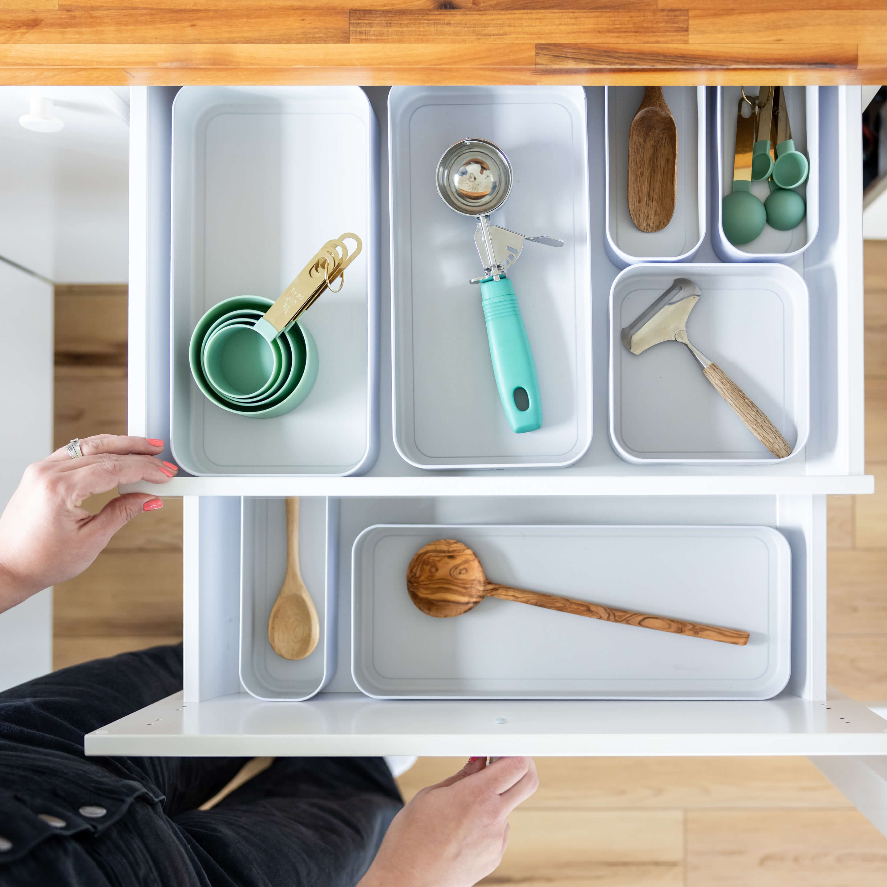
You’ve invested in beautiful, high-quality paints, so let’s make sure they last. Proper storage is key to preventing your watercolor tubes from drying out, cracking, or getting lost in a messy drawer. A simple and effective method is to group your tubes by color family inside clear bags or small storage bins. This makes finding that perfect shade of cerulean so much easier when inspiration strikes. You can then place these organized bundles inside a drawer. This not only protects the tubes from getting punctured but also turns your paint collection into a tidy, manageable system. Think of it as creating a functional library of color that’s always ready for your next project.
Maintaining Paint Quality Over Time
The life of your paints doesn’t end once they’re on the paper. To ensure your artwork stays as vibrant as the day you painted it, always start with high-quality materials, like archival watercolor paper. When your masterpiece is complete and ready for display, how you frame it matters immensely. Consider using materials with UV protection, like specific types of glass or acrylic, to shield your work from fading caused by light exposure. This simple step acts as sunscreen for your art, preserving the delicate hues and details for years to come. Taking care of your finished paintings is the final, crucial step in honoring your creative effort.
Organizing Your Workspace for Success
A clear workspace leads to a clear mind, which is exactly what you want when you sit down to paint. Having a dedicated and organized spot for your supplies makes the entire creative process smoother and more enjoyable. You can store your watercolor paper pads on a bookshelf like books, with the spines facing out for easy identification. Small palettes can be neatly filed away in a letter sorter, while your favorite brushes can stand upright in a cup or a stylish pencil holder. Using simple organizing solutions helps keep your desk clutter-free and your essential supplies within arm’s reach. This way, you can spend less time searching for things and more time focused on your art.
Related Articles
- 5 Best Travel Watercolor Paint Sets (2026 Guide)
- Watercolor Postcard Set – Travel Paint Kit for Artists
Frequently Asked Questions
Is it really worth the extra money to buy professional watercolors? Absolutely. Think of it less as a cost and more as an investment in your art. Professional paints have a much higher concentration of pure pigment, so a tiny bit of paint goes a very long way, meaning your tubes or pans will last longer. You're paying for colors that are more vibrant, mix more cleanly without turning to mud, and have superior lightfastness, which ensures your artwork won't fade over time.
As a beginner, should I just stick with student-grade paints? While student-grade paints are fine for initial scribbles, upgrading to a professional set early on can actually make learning easier. Professional paints are more predictable and responsive, so you'll spend less time fighting with your materials and more time learning about color and water control. You don't need a giant set; starting with a smaller, curated palette of 12 professional colors will teach you more about color mixing than a huge set of lower-quality paints ever could.
Do I need a set with 24 or 48 colors to be a 'real' artist? Not at all. In fact, most professional artists work with a thoughtfully chosen palette of around 12 to 18 colors. The real skill is in the mixing. A smaller set of high-quality primary and earth tones forces you to learn how colors interact, giving you the ability to create a nearly infinite range of unique shades. It's much more valuable to master a few versatile colors than to have dozens you don't know how to use.
What's the biggest mistake people make when they first switch to professional paints? A common mistake is being too timid with the paint. Because professional colors are so vibrant, it's easy to use too much water and not enough pigment, which leads to pale, washed-out results. Don't be afraid to load your brush with rich color. Another critical error is not using the right paper. Professional paints perform best on 100% cotton watercolor paper that can handle the water and layering techniques these paints excel at.
What are 'single-pigment' colors, and why do they matter so much? A single-pigment color is a paint made from one single, pure pigment source. This is a huge advantage because it makes your color mixing incredibly clean and predictable. When you mix two single-pigment colors, you get a bright, pure result. Many student-grade paints are made from a blend of several pigments to create a certain hue, and when you try to mix these, you can easily end up with dull, muddy shades. Using single-pigment paints gives you much more control and brilliance in your palette.